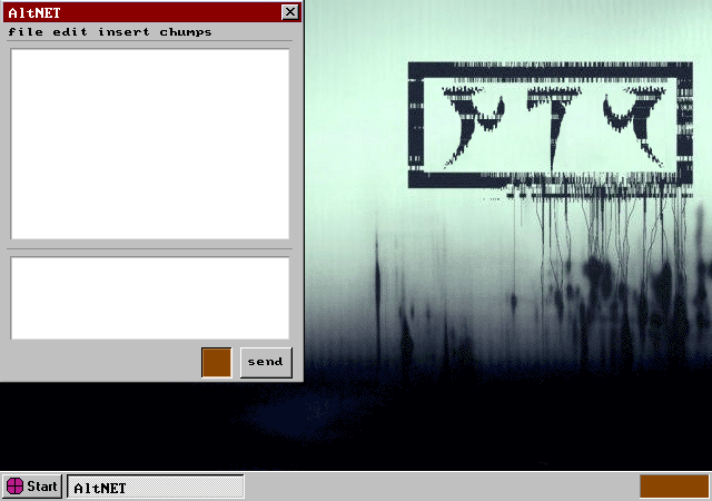
So, Slezer's desktop.

I chose a Windows 95-styled interface for two reasons- to set it apart from Homestuck and Hiveswap chronologically, and also because I really liked that interface. I miss it. I was too tired to draw icons in the background, so the chat client here conveniently covers them. I did actually draw the window there, although of course the text is all typed, and the bar itself was cleaned up from a screencap because all I could find were annoying jpegs.
Onto the background- it's based on the album art for NIN's With Teeth. I took a pre-existing background of that, and edited out the original logo, typed in NIN using the daedra font, flipped the last letter, and using the miracle of cut and paste+clipping layers+slight glitch effect, tried to make it at least look like it belonged there.
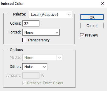
So the problem of course with these edits is all of the pages are gifs which have a hard limit of 256 colors. Exporting that directly to gif will lead photoshop to waste far too many colors on that, and not reserve colors that actually matter. Instead of dealing with that headache, I copy the contents onto a new photoshop document, convert it to an indexed image, and pare down the number of colors, usually somewhere between 8 and 32, depending on how many it needs to still be distinct, and how colorful the rest of the picture is.

Then I paste it back into the scene, export to gif, and revel in not needing to use too many colors because photoshop thinks rendering the exact details of Trent Reznor's face is more important than using 3 colors for characters horns or using 1 color for someone's sign.